


EP #2 // The “Filmic Look”
One of the most common creative briefs a colourist will receive is to make the show look “filmic”. In this episode senior colourist Angela Cerasi unpacks what that actually means, and explores how and why giving a project a “film look” can add greater meaning to your story.

TOPICS DISCUSSED IN THIS EPISODE:
- What a “film look” actually means in visual terms… and how it refers to how films used to look, as opposed to how they may look now
- What is a “video look” and how is it different?
- Differences in colour
- Differences in contrast
- What is “roll off”?
- Differences in texture
- Features of modern-day cameras
- What “filmic” signifies to a story
- Motion smoothing on your TV
- The feature colour is…
RESOURCES DISCUSSED IN THIS EPISODE:
- More information on motion smoothing
- More information about texture can be found in Angela’s column for the Australian Cinematography Mag, also here.
EPISODE IMAGES:
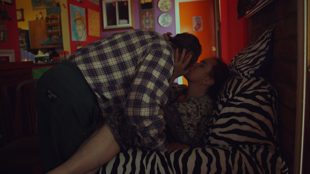
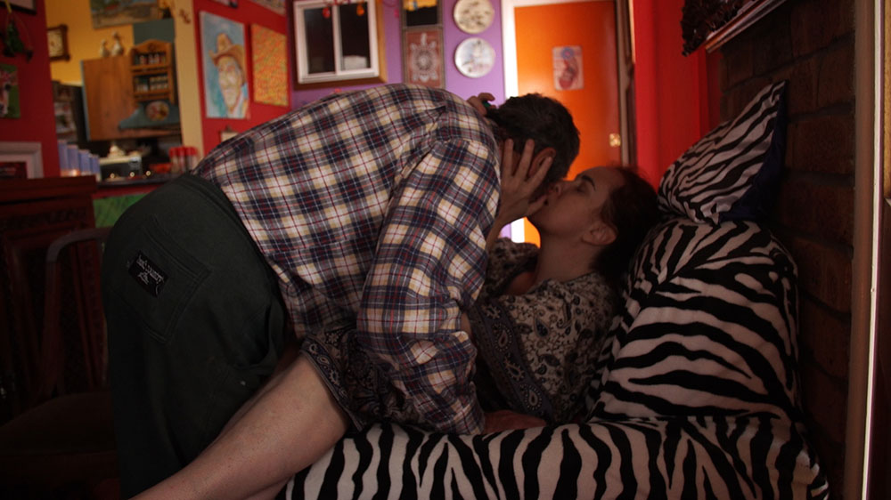
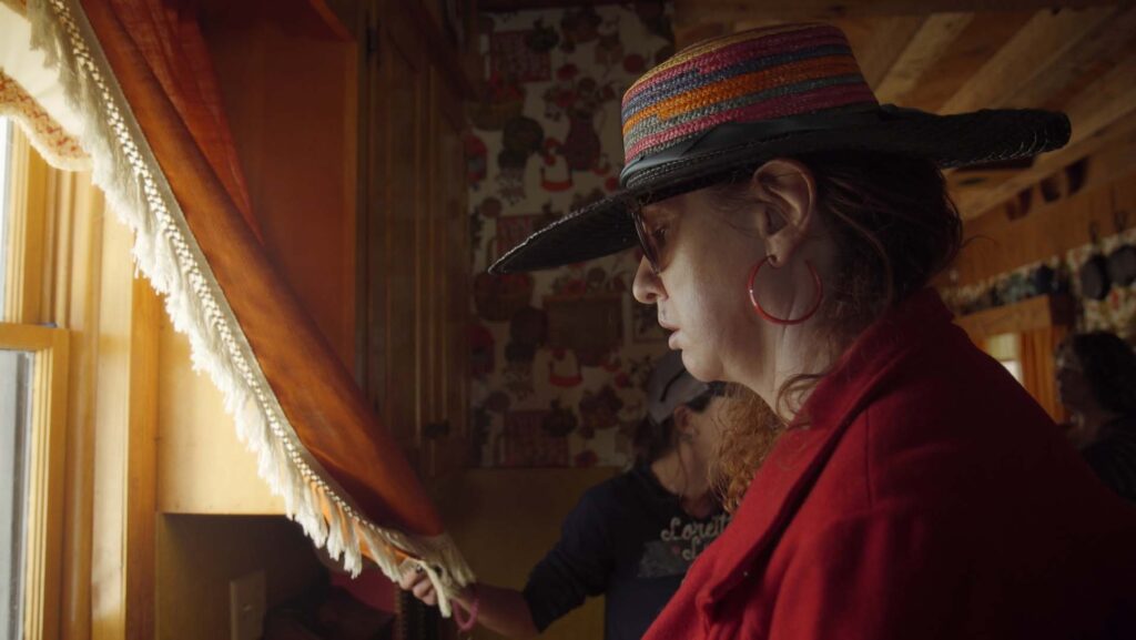
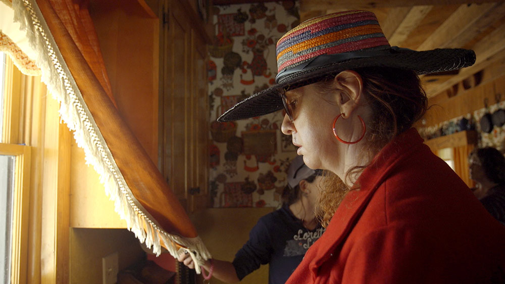
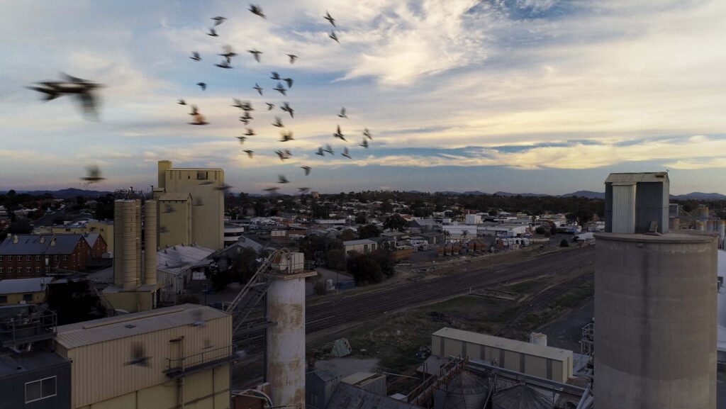
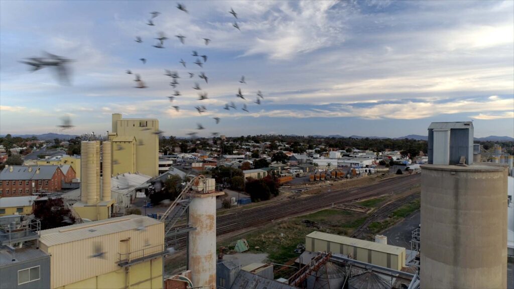
Check out these graded example images – one is graded with a filmic look and one is not – see if you can pick it – or check out the caption for the answer.

Graded to look “filmic”

The original video look
Graded to look “filmic”
The original video look
Graded to look “filmic”
The original video look
Graded with a “film look”
The original video look
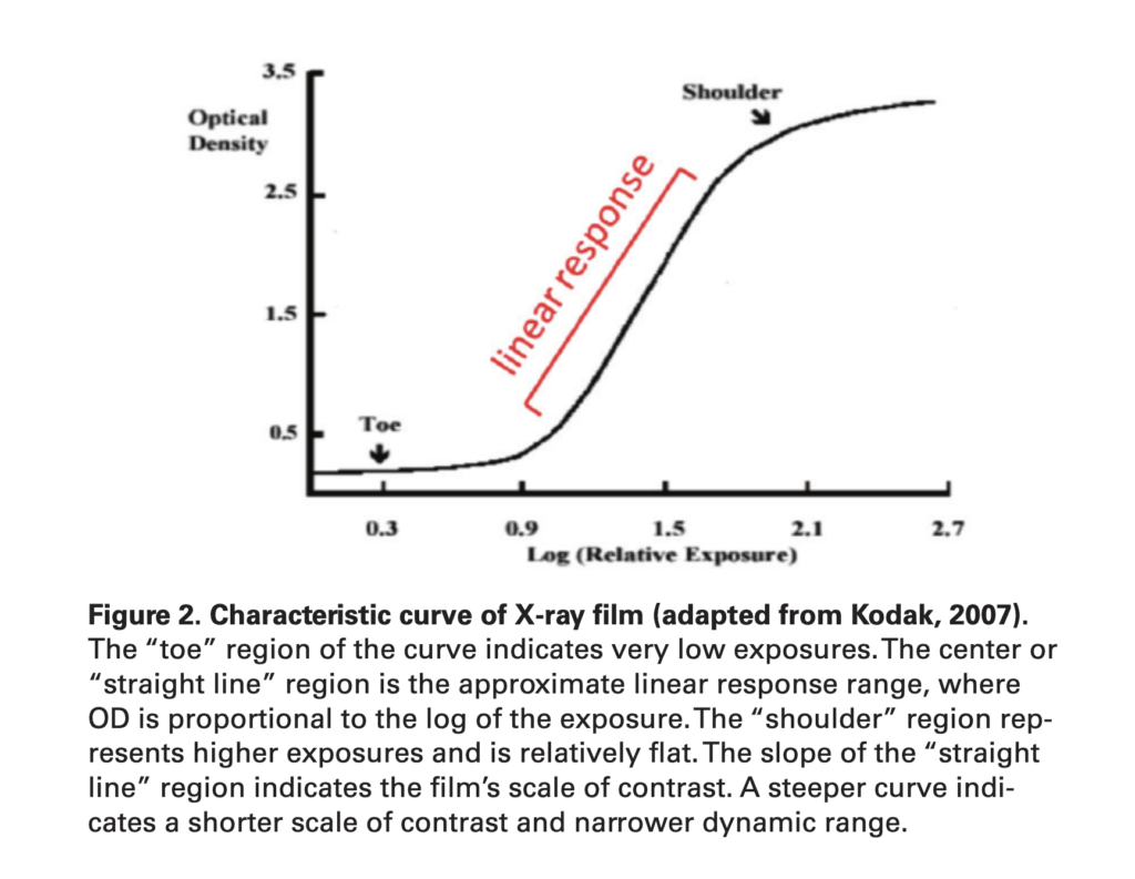
This is one of the simplest examples I have seen of film’s (LOGarithmic) characteristic curve. The “toe” and the “shoulder” is inherently unique to a “filmic look” and what gives the image its “roll off”. This curve is also commonly called an “S-curve” and indicates the image’s contrast. The steeper the curve the more contrast in the image. (Image: Schutz Geschwender, Amy. (2013). Chemiluminescent Westerns: How film and photochemistry affect experimental results.)
To see a full list of podcast episodes, click here.