


Texture: AC Magazine column
This column, “The Art Of Colour Grading: Texture”, written by Angela Cerasi of Peachy Keen Colour, was featured in the Australian Cinematographer Society’s “AC Magazine“. It is the second of Angela’s ongoing regular contributions to the magazine.
Hello! It’s Angela Cerasi, your new ACS columnist, giving you a random 500 word riff about something image-related. I am a senior colourist and founder of Australia’s delightful remote colour grading company, Peachy Keen Colour. Last issue we talked about the youthful and fun colour that is magenta, this issue we talk about something more touchy-feely. I give you, texture.
Like other elements that make up an image – camera angle, composition, colour, focus and lighting – texture has it’s own visual language and can give greater meaning to the story. Texture in screen production refers to the perceived surface of an image, whether it’s silky, rough, glossy, gritty, smooth, dirty, soft or clean.
In modern day cinematography, with exquisite data capture cameras like an Arri Alexa or Sony Venice, a well-exposed image shot with a new lens will appear slick, sharp and pretty perfect. This in itself is a ‘contemporary’ feel and might be spot on for your story. But what about the multitude of other feels that can be created with additional texture?
Back in the day, texture was inherent in images because we dealt with actual celluloid with silver halide crystals that had been eaten by chemicals. (Yes, how cool is back in the day??) When we raced the spools of developed film through a telecine or projector and shone through a light beam, we saw the composition of the particular film stock – fast film bigger crystals, slow film smaller crystals/finer grain – plus a whole myriad of textures like dust, sparkle (not to mention fogging and hairs)! Texture back in the day originated a little more organically and magically, but we now have greater control over our image’s ‘perceived’ finish. Grain, noise, sharpness, softness, blurring and noise reduction can be added in post-production, either to the entire film, certain shots, scenes or parts of an image.
It’s not uncommon for for a colourist to be asked to give a DOP’s crisp, slick, perfect images more of a ‘filmic’ look. A big element of creating a ‘filmic’ look is the addition of some grain. Grain takes the edge off a perfect image and gives the perception of something a little more ‘alive’. A subtle grain (finer grain or less strength) will do a lovely job of this, and adds an authentic and human feeling to the story. The addition of a stronger grain (bigger particles, more strength) will be noticeable and could help signify a period in the past, or a feeling of nostalgia or sentimentality. Film grain is like comforting and warm sound of a vinyl record crackle. Together with grain and some handheld camera movement, over-sharpening the image can subconsciously trigger an emotional response from the audience. It is unsettling, gritty and frenetic, and helps create a feeling of immediacy and danger. You can see every pore in the skin and create a weathered look. Textures like this might be used in a war film or a fight scene.
Opposite to grittiness is a silky, smooth look. Enhancing skin with some softening of mid-tone details is commonplace for rom-coms or commercial beauty work. In advertisements for chocolate the entire frame would usually have a smooth texture as the desired feeling would be luscious, creamy and glossy. If an image inherently has some noise because of a higher ISO or slight underexposure, colourists can add some noise reduction to smooth out any ugliness. Unlike the beauty of grain, noise can have digital artefacts or patterns in it, and is often speckled with unwanted colours.
Playing with texture in the colour grade can make fabrics appear more luxurious or mountains seem more treacherous. In a lifestyle TV episode, drone shots can be softly blurred to sit seamlessly alongside Canon C300. Texture is an aspect of cinematography which can be over-looked, but it not only adds depth and richness to visuals, but is a powerful tool in creating cohesiveness, juxtaposition, or the right “feel”.
P.S. This column’s feature word is ‘handles’. An editing term relating to the original source footage either side of the selected shot. The extra footage before the clip’s in-point and after the clip’s out-point. Colourists colour grade the edit, ie. a timeline of selected shots, but they often export the selected shots back out of their software with 25 frame ‘handles’. This means if the edit slightly changes there is breathing room to do so, without needing to go back into a colour grading session.
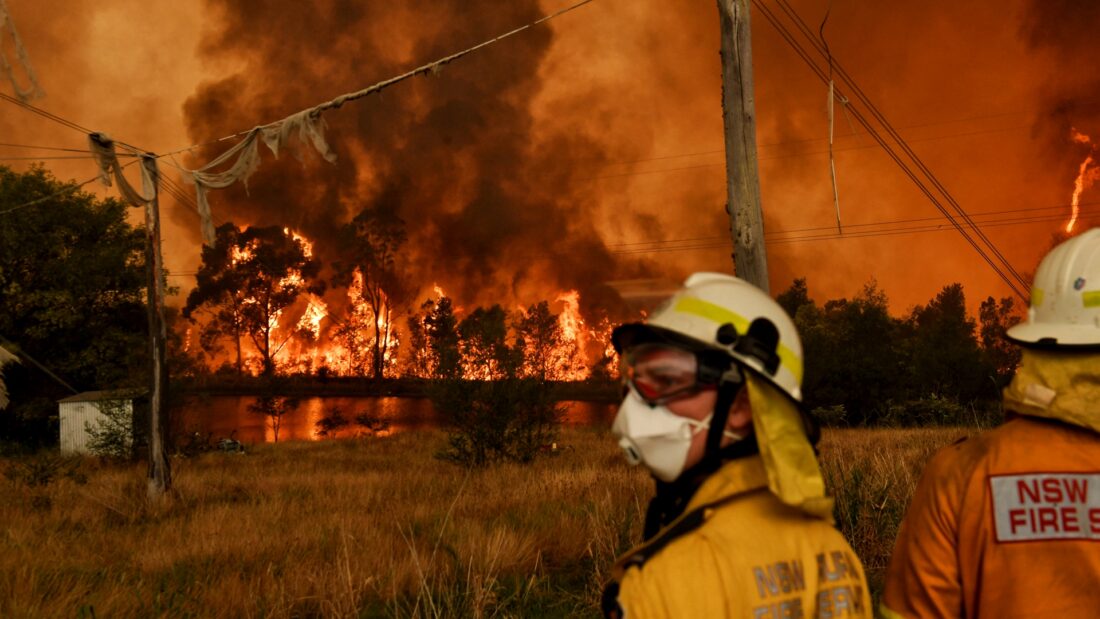
Image from Big Weather (And How to Survive It)
Series Director: Daniel Marsden
Series Producer: Mick Angus
Production Co: DMA Creative & Northern Pictures
DOP: Mark Broadbent ACS, Peter Coleman, Phil Dow
Post Production: The Post Lounge
EPs: Mick Angus, Karina Holden, Chris Thorburn
Enjoy this article? If so let me know at angela@peachykeencolour.com.au or DM me at @angela_cerasi
Interested in learning more about the “filmic look”? You can listen to this episode of Angela’s podcast, also called “The Art of Colour Grading”.