


Magenta: AC Magazine column
This column, “The Art of Colour Grading – Magenta” written by Angela Cerasi of Peachy Keen Colour, was featured in the Australian Cinematographer Society’s “AC Magazine“. It is the first of Angela’s ongoing regular contributions to the magazine.
Move over Carrie Bradshaw! Angela Cerasi is tapping at the keys composing a sparkly new column – The Art of Colour Grading. For those who know me from my podcast of the same name, you’re in for a treat. You can expect the same honest insights, random analogies and unique female, artsy perspective.
For those who don’t know me, I’m a senior colourist and after 15 years of colour grading in Dublin and Sydney, moved to the coast of sunny Brisbane with my Irish husband, 3 kids and dog. It was here that I founded the remote colour grading company, Peachy Keen Colour. As you will discover, I love the artistry of grading and the creative use of colour in visual storytelling.
I’ve decided to dedicate this first column to the most misunderstood and underused of all the colours, my favourite colour, the vibrant, delightful and magical magenta.
Poor magenta gets a bad wrap – everyone hates unintentional magenta in their image! Especially images with caucasian skin tones. Often if you need to remove magenta out of this skin, you neutralise it by increasing the amount of green. This is because green sits on the other side of the colour wheel and is magenta’s complimentary colour. It is often a fine balance between having these skin tones too pink, or tinged with green. The only thing worse than magenta in the skin is green in the skin! Black skin on the other hand can definitely handle magenta and green. In fact, if lit intentionally with gels of this colour, portraits of people of colour can be extremely dynamic and striking.
If magenta had best friends their names would be Red and Blue. Magenta is the pinkish-purpleish-red colour in between these two sensible and reliable primary colours. Analogous colours like magenta, violet and blues are visually pleasant together because they don’t fight each other for attention – they are great mates. Magenta and dark blues together can be naughty though (watch out), think dramatic, intense, playful, confident with a splash of sexy. Moving toward the warmer tones of red, another analogous colour to magenta is soft pink hues. Together this colour palette can be romantic, feminine and youthful. Think perfume commercials with shallow depth of field, soft highlights and a feminine and airy feel.
So how can you intentionally bring magenta into your colour palette? In pre-production think about costume, clothing or accessories. With set design, can you paint a wall or add soft furnishings? In regards to lighting, would it work for the story to go bold and use magenta gels? Magenta in your midtones and whites can be a daring but beautiful choice. It can be quite uncommon to see on screen, so personally I find it striking and glorious. If the story warrants it, introducing magenta can be a way to enhance a feeling of youthfulness and fun.
P.S. This column’s feature word is LUT. Rhymes with nut. A reference file used by colourists, cinematographers and editors to convert images from one colour space to another. Arguably, limiting your use of creative LUTs on set to one or two (eg. Day time and night time look) can be more effective. This is because there is less chance of error with the incorrect LUT being put on a scene and then causing incorrect lighting choices, and getting to know one or two LUTs really well means you can come to understand how they affect the image captured on the sensor across a variety of scenes, making better choices regarding lighting and exposure.
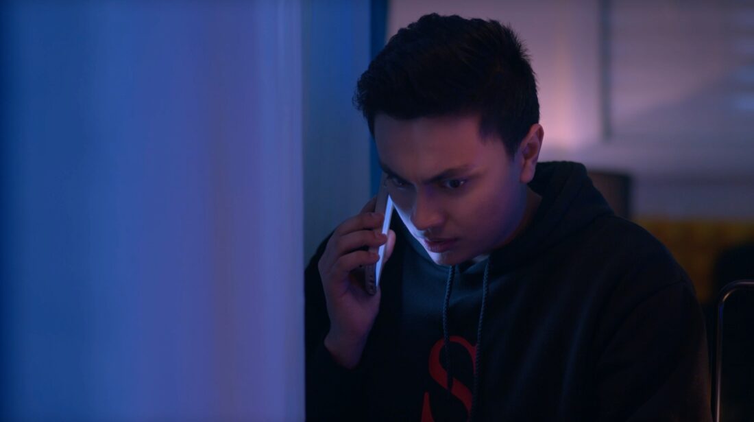
Image from Unknown Filter by @sakshammagic DOP: Shing Fung Cheung
Is there a colour topic you’d like me to riff about? If so email angela@peachykeencolour.com.au or DM me at @angela_cerasi
Interested in learning more about colour theory? You can listen to Angela’s podcast about the colour blue via this link.