EP #3 // Grading Documentary
“Make it look natural” is what we have traditionally heard during the creative brief for a documentary grade, but what does this actually mean and is there a better way? Senior colourist Angela Cerasi explores how images can have deeper meaning whilst still “looking natural” and explores new visual trends in the colour grading documentary space.
TOPICS DISCUSSED IN THIS EPISODE:
- Current trends in the visual looks of documentary
- Discovering the overarching tone of the film
- Going further than colour correction
- When and why to go with a “video look”
- Subverting what is expected
- Cinematic documentary
- Career lessons regarding “stylised” grades
- The feature colour is…
EPISODE IMAGES:
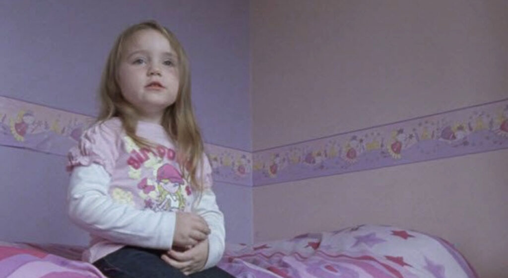
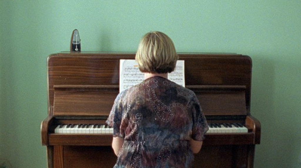
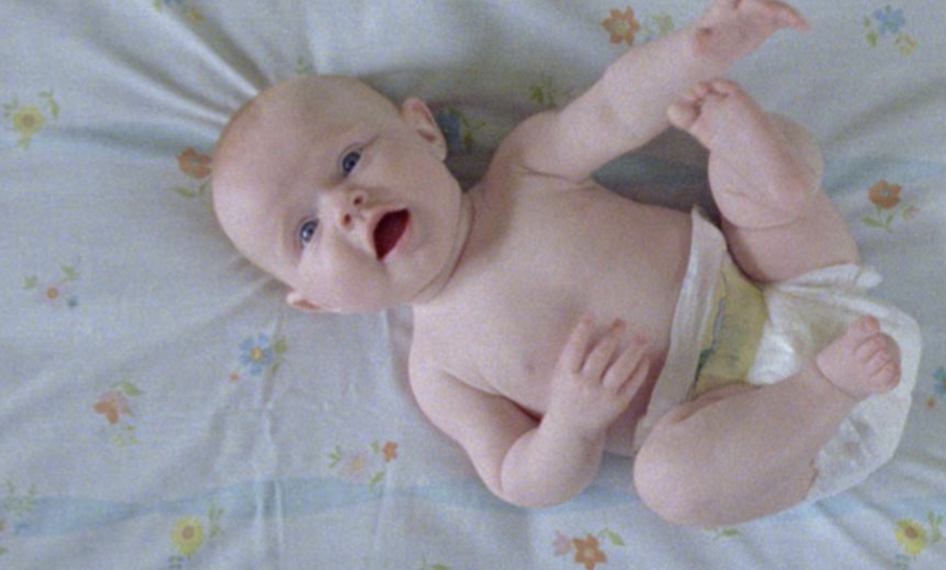
Some stills from the Irish feature documentary, ‘His and Hers’ (2010) showing a soft, low contrast look. Interviews with 70 different women in 70 different houses flowed together through a seamless look – no colours, shadows or elements jarring and distracting, and no interview standing out more than another. This enhanced the intention of the film which was one united story of love.

To see the full list of podcast episodes, click here.
What other types of topic will Angela Cerasi be exploring in the podcast?
- An introduction to colourist Angela Cerasi – her life and career path
- The “Filmic Look”
- Colour Grading Commercials
- Explainging all about LUTs, without the tech talk!
- Explaning all about HDR Grading, in easy-to-understand language
- Giving your Colourist the Best Creative Brief
- Being Creative and what to do when you’re struggling to find your creativity
- Considering the impacts of Light and Darkness on story in pre-production, production and post
- Considering the colour blue and how it impacts on storytelling
You can also read this blog about Colour Grading Documentary on the Peachy Keen Colour website.


