ASK THE COLOURIST: PART 2 – ‘magenta’, ‘warm it up’ & ‘softer’
ASK THE COLOURIST: PART 2 – Featuring “Magenta”, “Warm it up” and “Softer”
Colourist Angela Cerasi answers reader questions about common colour grading language
In Part 1 of my “Ask the Colourist” blog series, it was explained how this series of blog posts would aim to unpack some colour grading language and turn it into easily understandable terms. I had some great feedback about “Crush the Blacks? Split the Diff? and How to make something Fluro?”. Reminder to email me at angela@peachykeencolour.com.au if you have any terms or questions you would like me to decode or answer. Here’s the next instalment!
MAGENTA?
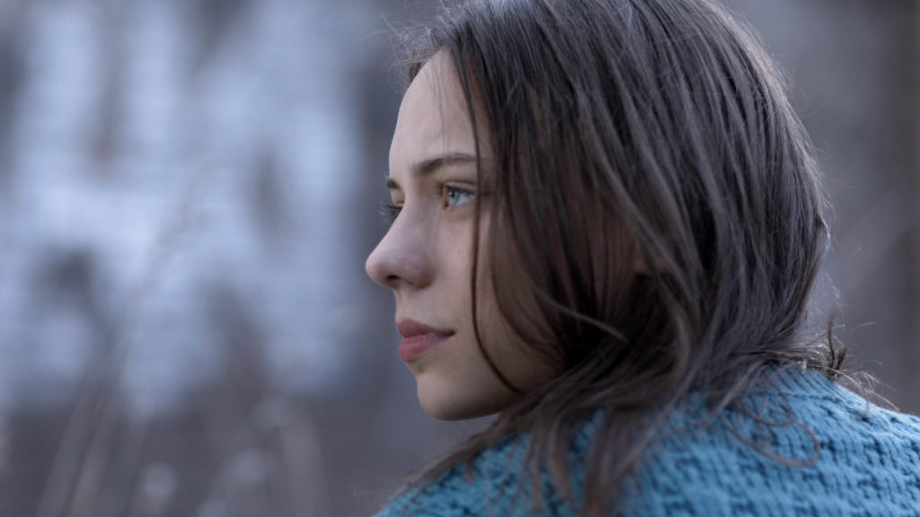
Magenta is basically a fancy pants word for the shade between red and blue. A purpley-pink. This word is often thrown around in a grade suite if the skin tones look too pink or red, someone might say “it has too much magenta”. Poor magenta gets a bad wrap… no one likes magenta! As a colourist when you pull magenta out of the image you are increasing the green, (decreasing one colour increases the complimentary colour) so often when you pull the magenta out you do it just slightly because no one wants a green image either. Pulling magenta out of skin tone and going toward green will make it less red and more yellowy instead. No one wants a ruddy skin tone and often too much magenta in an image can be very undesirable.
WARM IT UP?
All images are basically on a scale of warm through to cool. A warm image is literally in the realm of red, orange and yellows. It is probably lit by tungsten (artificial lamps) or candlelight. A cool image on the other hand is in the world of blues. It might be lit by natural daylight which is actually blue compared to artificial interior lights. In advertising warm images can be more appealing and pleasant so being directed to “warm it up” is quite common. Skin tones are warm by nature and it’s really important to get warmth in the skin tones in most cases so the character looks healthy and well. As a colourist who needs to warm up an image, depending on the image you are working on you can add yellow/orange to the midtones (which will usually affect the skin tones), highlights (skies, brightest parts of image) or shadows (blacks). The most common thing to do would be to warm up the midtones/skin tones, and increasing yellow/orange means decreasing blues.
SOFTER?
Making an image softer has nothing to do with focus and should not be confused with soft focus. We always want sharp images (unless you are doing a drunken POV for example!) and the sharply focused image can have a soft feeling to it. You can make an image “softer” a few different ways. In practical terms it can be executed by decreasing contrast, lifting blacks, rolling off highlights. You could also desaturate any jarring colours so they were not so bold and strong. Also slightly blurring the picture or a part of the picture if the pixels looks too sharp. Often Go-Pro’s are too sharp and will need to be softened to match other shots in the sequence if they are not Go-Pro. The effect of ‘softening” can make the image more pleasant, feminine, flowing, cozy and “nice”. The opposite of making an image softer is making it more “punchy”, hard, harsh or crisp. Examples of commercials that feel soft are usually baby-related ads, life insurance ads and ad’s for fabric softener!