


ASK THE COLOURIST: PART 1 – ‘crush’, ‘split the diff’ & ‘fluro’
ASK THE COLOURIST: PART 1 – Featuring “What is crush the blacks?”, “Split the diff?” and “How to make something fluro?”
Senior Colourist Angela Cerasi answers reader’s questions about commonly used colour grading language in this “Ask the Colourist” blog
Hello and welcome to my first Q & A post! Shout out to my girls at the ‘Free the Bid’ workshop last weekend who submitted the content for this post and some of the future ASK THE COLOURIST posts. If you have a piece of terminology or a phrase that you have heard thrown around in a colour grading session and you have no idea or a vague idea what it means, feel free to email it to me at angela@peachykeencolour.com.au No judgement here and all will be anonymous. The goal is that next time someone geeks out about LUT’s or codec’s in your session, you can have the confidence and knowledge to know exactly what they’re talking about and why it does or doesn’t matter to the actual story at play!
Disclaimer: I will try and decode any jargon in my answers!
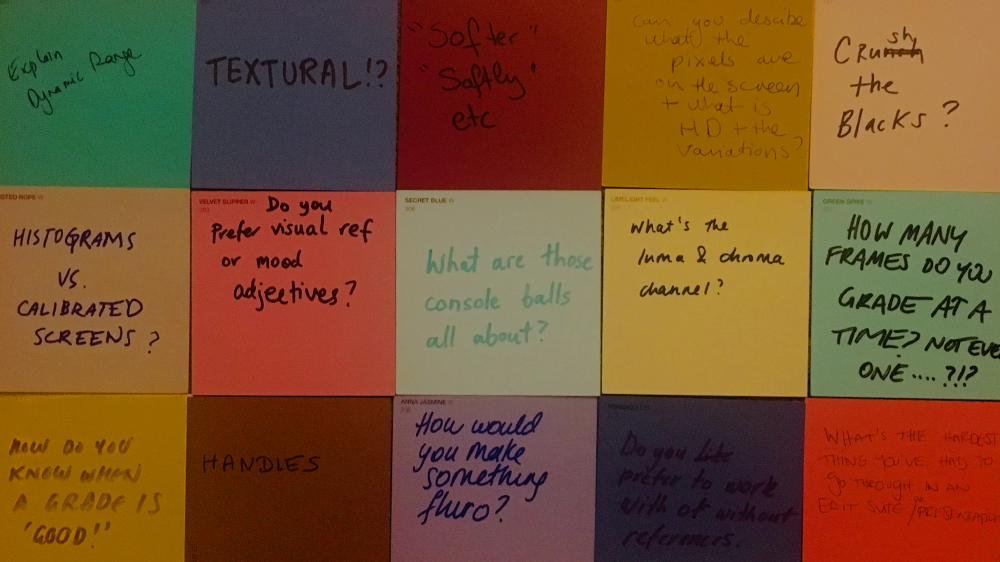
CRUSH THE BLACKS?
This is often used to describe a style which is heavy on the blacks (read: dark blacks, deep shadows) and you will often see this look in an action film or gritty, grungey work. If the luminance (brightness) in your image is made up of whites through to black and all the colours in between, the bottom end of the luminance channel (the “toe”) which means the light shadows, the shadows, the dark shadows and the black would all be crushed down to a black level. Often some details in the shadows can be lost but perhaps those details aren’t important. The overall effect of crushing the blacks is often a hard look. Sometimes it can feel cinematic because in the cinema there is the scope for the picture to be darker (dark environment means our eyes just and we can see more in the shadows). The opposite to crushing the blacks would be to pull more detail out of the shadows and sit the shadows up. The image will feel lighter and not so heavy. Examples of works which do not crush the blacks are commercials for baby related products like nappies, hygiene/cleaning products and romantic movies! Examples of works which often crush the blacks are action films, horror and hard hitting drama.

This still from Narcos Mexico has “crushed blacks”. The shadow areas have been crushed down to black and detail has been lost. However the overall effect which is gained is that the scene looks gritty, the room looks dingey and the emotion that you can see in the lit part of the character’s face is emphasised as it’s the only part we can see.
SPLIT THE DIFF?
Splitting the difference between one look and another is literally going half way between the two looks. In our colour grading software there is an option to set the output to 50%, but if we don’t want to get so technical about it the colourist can just do it by eye. An example may be adding a heavy sepia look to the image, splitting the diff would be reducing that look back by 50% to where we were before and not going so hard on it.
HOW TO MAKE SOMETHING FLURO?
I wonder if this question means fluro colour or fluro lighting? Best thing to do is use fluro/neon coloured clothing or lights from the get go. Failing that we would crank (increase) the saturation of the object but also crank the luminance/brightness. You could twist any primary colours of red, green, blue to lighter/brighter versions. Cool thing about fluro colours is you get those really unique candy pinks, apple green, off the chart yellows. You could slightly desaturate everything in the scene to make the neon stand out even more.
Most peeps try and alleviate fluro lighting that may have been captured unintentionally on set. It can be pretty nasty on skin tones and give an unwanted green cast. If you want to try and make something look more fluro (ie. like a night time scene in a 7-11), you would increase the brightness and take the whites and top end of the luminance channel towards a light apple green colour. If you can see the practical lights you could make them glow or make the entire top of the frame a little hazy (read: lower contrast, but sitting bright) because often fluro light is just so garish and bright.
You can check out Part 2 in the “Ask The Colourist” blog series here.
For more colour grading tips – check out this blog post on How to Grade in Black and White, on the Peachy Keen Colour website.