


Landscapes: AC Magazine column
This column, “The Art of Colour Grading: Landscapes”, written by Angela Cerasi of Peachy Keen Colour, was featured in the Australian Cinematographer Society’s “AC Magazine“. It is the fourth of Angela’s ongoing regular contributions to the magazine.
Give me a landscape to colour any day of the week. Besides being a joy to grade, I love how landscapes give the viewer an opportunity to take a beat, and soak in a location. No matter if it’s a seascape, bushscape, desertscape, cityscape or moonscape (ok I’m yet to get one of these!) it’s often a welcome reprieve in a character driven storyline.
Both natural and urban landscapes help establish the critical storytelling element of time and place. As a cinematographer you think about the composition, camera angle and lighting in your viewfinder, as a colourist I build on your creation and think about the colour, luminance and texture. Together we can make a landscape shot reflective and unassuming, or breathtaking and sublime.
As most cinematographers would know, there are some crucial things to think about when creating a landscape image. Incorporating elements in the foreground to add perspective and a sense of scale to your composition. Looking for natural lines such as rivers and roads that can lead the viewer’s eye and create a sense of depth. Knowing the rule of thirds and making sure there is enough head room above a straight horizon. Capturing the landscape at sunrise or sunset or during interesting weather conditions.
Once the landscape image is in Post, it takes on further meaning by its chosen placement in the edit. As a colourist I would not only enhance what is present in the frame, but look deeper into the context of what is happening story-wise at that point. Does the landscape need to be inviting, welcoming, warm and inspiring? Or menacing, threatening and overpowering? Does it need to grab attention, appear striking and extraordinary, or be understated with a more subtle beauty?
Creating this mood in practical terms might mean reducing contrast and increasing brightness in areas of mist and fog to create more ambience and mystery, heightening drama and intensity by applying mid-tone detail or sharpening to rocky cliff faces or choppy oceans. If we need the landscape to look vast and have grandeur, I might vignette the image (always large soft and feathered), invert it and then brighten the outside to give the illusion of more space and openness. If we need the landscape to look ominous, I may do the opposite. Can I push in some dramatic sky colour or use a window to create a focal point in a specific area of the frame?
My top tip to grading a banger of a landscape (and arguably all images!) is the presence of colour contrast. If you have warmth in highlights you need some coolness in shadows and vice versa. The first thing I always do with a landscape image is play with the temperature and tint to correct the colour – get clouds white and clean blacks. From here you can play with the mood and go into details, but your starting point is always solid.
Achieving colour contrast in an Aussie bush landscape can be like trying to get a dog to stay in a bathtab! Difficult to say the least. Brown upon green upon yellow green upon brown upon green. To create depth and contrast I often look for a feature element like a stand out tree, path or hill. To make this a focus you can ramp up it’s presence in the frame through luminance, saturation or contrast, and defocus or desaturate everything else. Subtly of course!
The art of colour grading a landscape is in subtleness. Creating an effect without anyone ever knowing that you were there. The challenge is bringing mood without overproducing the image and making it feel like a tacky holiday postcard. If done well, landscapes not only establish time and place but allow the viewer to pause, breathe and feel.
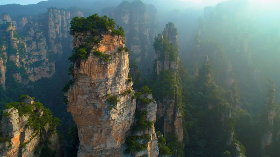
China landscape cinematography by Tim Noonan, colour graded by Angela Cerasi
Enjoy this article? If so let me know at angela@peachykeencolour.com.au or DM me at @angela_cerasi.
Interested in remote colour grading but not sure how it all works? Check out these blogs on how to supply your media here, and how to give the best creative brief even when you’re not in the room (including a free checklist) here. Check out Angela’s first AC magazine column “The Art of Colour Grading: Magenta”, here.