


5 ways colour grading can enhance a story
“It’s easier to make colour look good, but harder to make it service the story” this quote by cinematographer Roger Deakins is spot on. I feel like there are infinite examples of how colour grading can be used to enhance a story but let’s throw five out for the fun of it. I think an important thing to remember is less is often more so that the “look” doesn’t have the opposite effect and jar you out of the story.
1. If a story is to feel soft, romantic, dreamy, ethereal, then the colourist can use some colour grading tools to enhance this feeling. Examples might be lifting the shadows to make the overall image feel lighter, softening contrast levels, slightly blurring the image to take out any over-sharpness, twisting or de-saturating hues to make them more pastel and less bold, sitting the midtones a little higher to make the image feel less dense and heavy, using shapes to create a sun flare effect in a portion of the image.
2. During the climax of a story, colour can be “turned up” a notch to reflect the intensity unfolding on screen. This could be done by slightly cranking up the contrast, or the saturation of all or selected colours. A “harder” or more “intense” look could be achieved by taking the current look and pushing it a bit further, for example an otherwise natural look could have some more stylised elements brought in. Examples of this might be blowing out the highlights, crushing the blacks a bit more, saturating the warm tones, making the overall image more dense in comparison to other scenes before or after it.
3. If there is a scene which is meant to feel off balance, off kilter, like something is not quite right, green could be used to mirror this underlying feeling. Often used in horror films or sci-fi, colours on the green spectrum can be used in the same way that a dutch angle might be used in cinematography. Green is often the colour of sickness and it can feel like an unnatural light source (as opposed to the natural colours in our atmosphere of cool overcast blue or warm sunny yellow).
4. The use of shapes to darken/brighten areas of an image can be a great tool to enhance the story. My personal favourite is vignettes (oval shapes) and I pretty much use these in some capacity in every work. If a character in a story is feeling bogged down or oppressed in their situation perhaps their scenes could have a soft vignette covering the top third of the frame to darken it down a little, reflecting their mental state. If a work is trying to focus the audience’s attention in a direct way, maybe a vignette could be used to brighten this element or portion of the frame and then the inverse to let everything else be more dim.
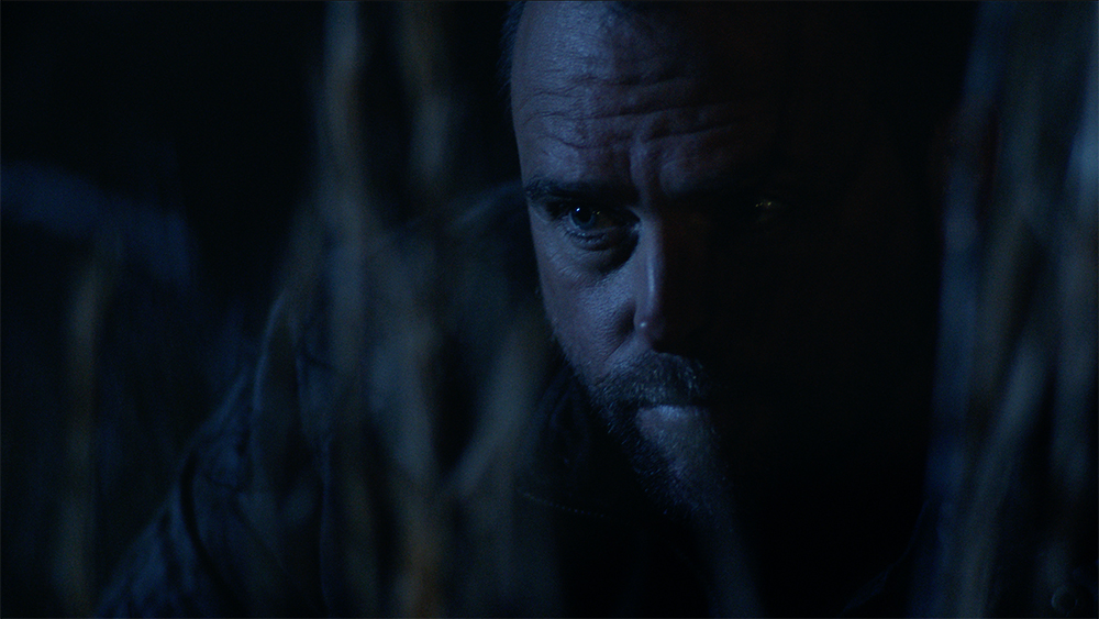
5. Blue is a colour which can be experimented with to create feelings of sombre, sadness, endings, misfortune and unhappiness to name a few. If the mise en scene is not overly blue through costumes and set design or location, colour grading can still create a blue/cool look by reducing warmth in the highlights, midtones and/or shadows. Reds can be de-saturated, cyans can be saturated. De-saturating the entire image will also usually render it cooler and can reflect the underlying tone of the work too.